Monday 13 December 2010

Edited Photos

Blogged by Anya

Before looking into creating our poster and magazine cover, we found a photo that we really liked. I chose to edit the photo we chose to see the different atmospheres that we could create with it.

Before editing, I used the different settings on the photo editing software I was using to see what each would do.

Colours:


Brightness:


Contrast:


Gamma:


I then used a combination of these to create effective edits:


Fonts

Blogged by Naomi

Today we also looked at possible fonts for our poster/magazine cover. We used the fonts readily available to us on Word but found that the website DaFont had many more fonts that would suit our poster/magazine cover more. After searching the website we downloaded a variety of fonts we felt would be relevant and fitting with the horror genre and would work well against our chosen images.


When we wrote up our title in the fonts we had downloaded we realised that some of the ones we had chosen would not be as successful as others. They were either difficult to read or we felt that they would detract the eye from the audience. Others we felt would also be 'lost' against the image/background of our poster or magazine cover. However, the decision for the font we shall use was unanimous, and we both agreed that the font Broken 74 was the most suitable and would be the most effective.


This was our favourite font as it subtly creates an atmosphere of terror and reflects the genre of horror perfectly. The jagged edges and scratched effect mirror the tension and suspense we hope to convey in our trailer. Also, the scratches across the writing look similar to the barbed wire fence of the pheasant cage used in the footage, so the font itself can be directly linked to the trailer. This font is powerful and put against an image for our poster/magazine cover will not detract attention from the image or 'fade into the background'.

Magazine Research Continued

Blogged by Anya

We looked at a few different magazine covers from both Empire and Total Film. We couldn't find any horror based magazine covers but we felt that if we were looking at the layout of the cover then it shouldn't matter that the film genre is different.


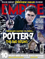
This magazine uses a posed photo of Harry Potter, plus three smaller photos of other significant characters from the film. The photo makes it seem as if Harry Potter has smashed glass, and the other characters are reflected in some of the shards. This along with the expressions of the characters make the photo look tense.
This photo is also linked with the tag-line 'Friendships shatter. Evil unites' which is in yellow to stand out from the dark background.
Apart from the masthead, 'Potter 7' is the largest font on the page. It is white so that it also stands out from the background and is a bold, clear font for easy reading. Under this title, is the second part of the tagline 'The end begins', this helps build the tension and excite fans of the film because it is quite an ominous statement.
The masthead is the usual Empire font and colour and some of it has been blocked by Harry Potters head which makes it seem as if the film is more important than the title, but it is also because the magazine is successful and so people know what it is without seeing the whole title.
The cover also contains a barcode; a tag-line at the bottom of the page, which has it's own background; tag-lines on the right of the page which are introduced by the title 'Plus!' and a tagline which promotes the magazine itself 'our best preview issue ever' which is above the masthead.


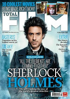
This magazine also uses a posed photo of the main character of the film; this time 'Sherlock Homes'. As with the Empire cover, the photo takes up the whole of the page and the colour scheme of the cover fits with the colours in the photo. Whereas, the Harry Potter cover advertised a 'preview issue' this cover advertises a 'world exclusive'. Again, the title of the film is the largest text on the page excluding the masthead and it is a clear font that catches the eye.
The main article on this cover has two tag-lines, the first is a quote, presumably from an interview and the second, smaller tag-line says 'On set!' which connotes a behind the scenes look at the film.
There are more tag-lines on both sides of the page. There is a main title in blue capitals that draws attention and a small description underneath. There is also a tagline above the masthead with three smaller photos. This tagline promotes the '10 coolest movies' and draws in the reader because it seem exciting. AS with any magazine cover, there is also a barcode, date, price and the website address of the magazine.


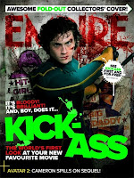
This is our favourite of the magazine covers that we researched because it catches the eye and apart from one other tagline, the whole cover is dedicated to the one film; including the masthead which looks like blood. The main image is of the main character and the two other 'super-heroes' featured in the film are part of the background which has connotations of comic books.
The title of the film is the brightest thing on the page and is the first thing you see. The colours used on this cover are bold and are designed to draw attention.
Again, there are two tag-lines for the main article, the first 'It's bloody! It's brilliant! And, boy does it...' leads into the title of the film and is a clever play on words. The second 'the world's first look at your new favourite movie' creates excitement because it it seems to be a world exclusive and it holds the film in high regard by telling the reader that it will become their new favourite film.
The only tagline on the page that does not involve 'Kick Ass' is at the bottom of the page and introduces a new colour to separate it from the main article.

We think this is the most effective front cover, especially for a horror movie. We really like the blood style font of the masthead and will try to re-create this on our own magazine cover.

Magazine Research

Blogged by Anya

Today we looked at Empire magazine front covers as research for our own. We chose to look at Empire because it is a successful, current movie magazine.
From our research, we found there were two types of front cover. There were the ones that focused on the actor(s) and covers that used stills/posed shots from the film itself:


We decided that we would prefer to create a magazine cover that used either a screen shot of the film or a posed shot with the actor in character, rather than focus on the actor herself. We felt it would be more effective for a horror film to have a scary magazine cover as promotion rather than distract with the actor.

Monday 6 December 2010

Editing Footage & Ideas

Blogged by Naomi

Using iMovie we again edited the footage we have to start to create suspense and tension. We have cut the scenes where our character finds her friend's possessions as we have decided that finding only one possession will create more suspense without giving too much of the storyline away.

We also had an idea to see if Anya's Granddad had any pheasants he had captured when out shooting that we could include in our trailer. If he does then our plan is to have the main character finding the possession next to a small puddle of blood. As she looks up she discovers a row of pheasants, which could subtly imply that she may also end up in a similar state.

We have also moved the running shots to cut in between the shots of Lily shouting out to her friends rather than them being a long sequence at the end of the trailer. We felt that this would be more successful in creating tension and suspense.

Weather Conditions

Blogged by Naomi

Although we had to put our filming on hold for the weekend due to the snow, luckily for us the majority snow has now cleared and so we will be able to resume filming the remainder of our trailer this weekend. Since we already have made a list of what we still need to film we can focus directly on getting our footage and not spending part of our filming time deciding what else we need to do. Also any last remainders of snow or ice in the woods should have gone before the weekend, meaning that we will not need to re-shoot for continuity the footage we already have.